Editing style
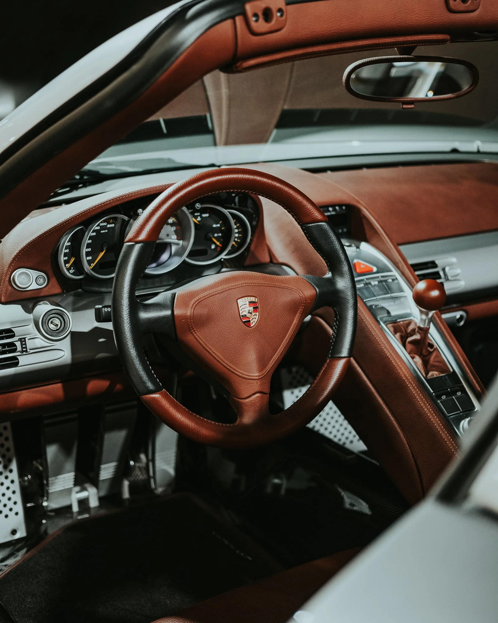
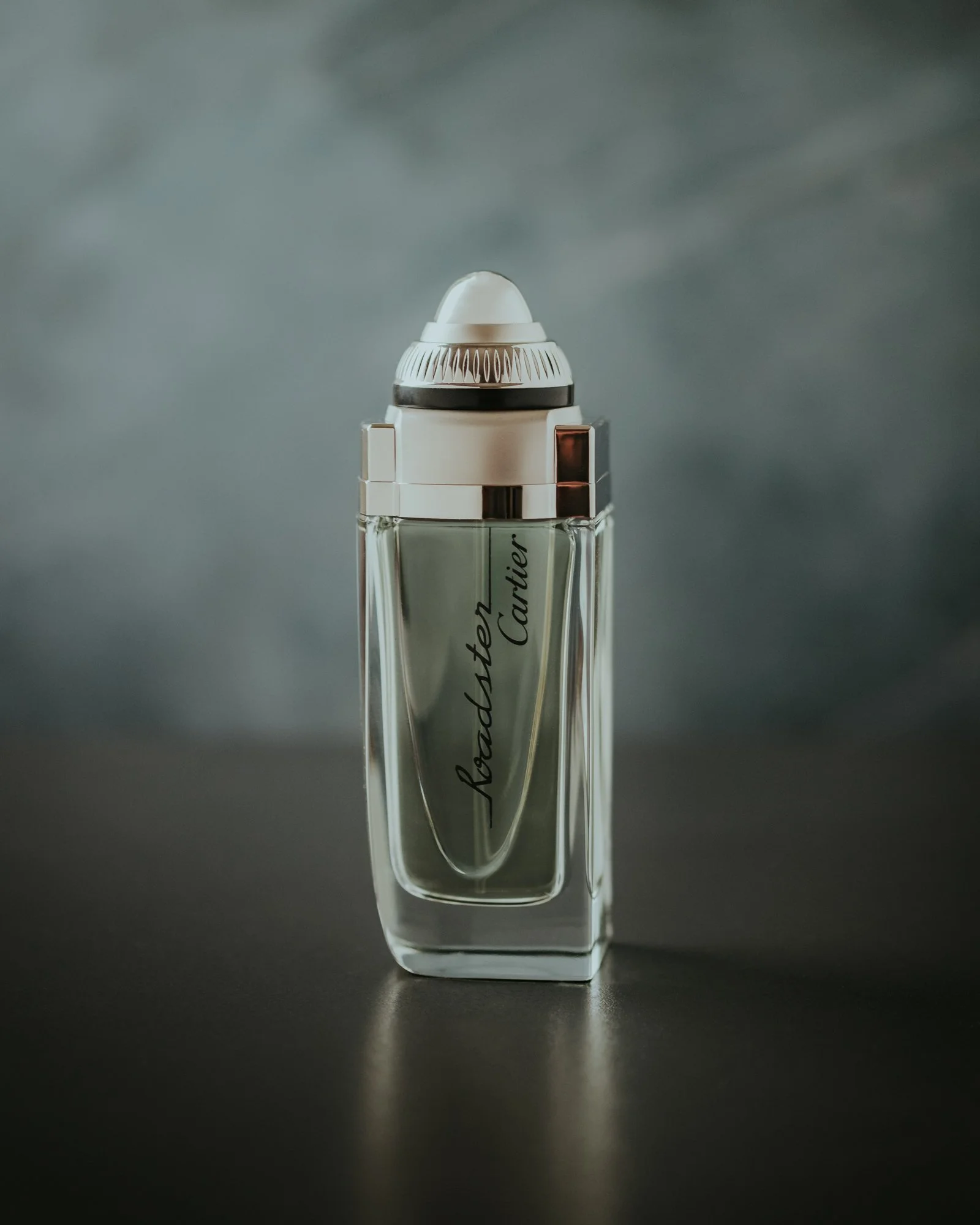
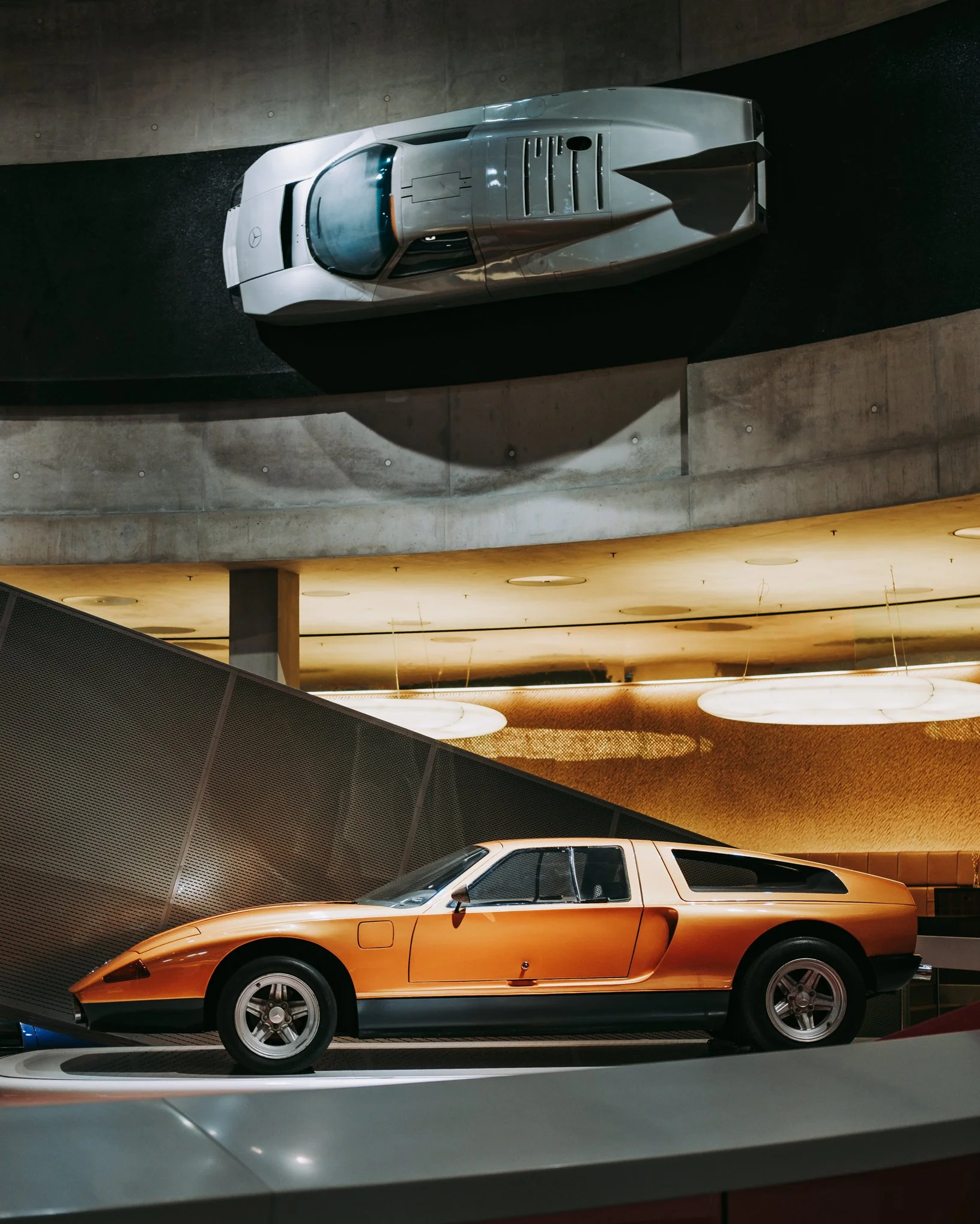
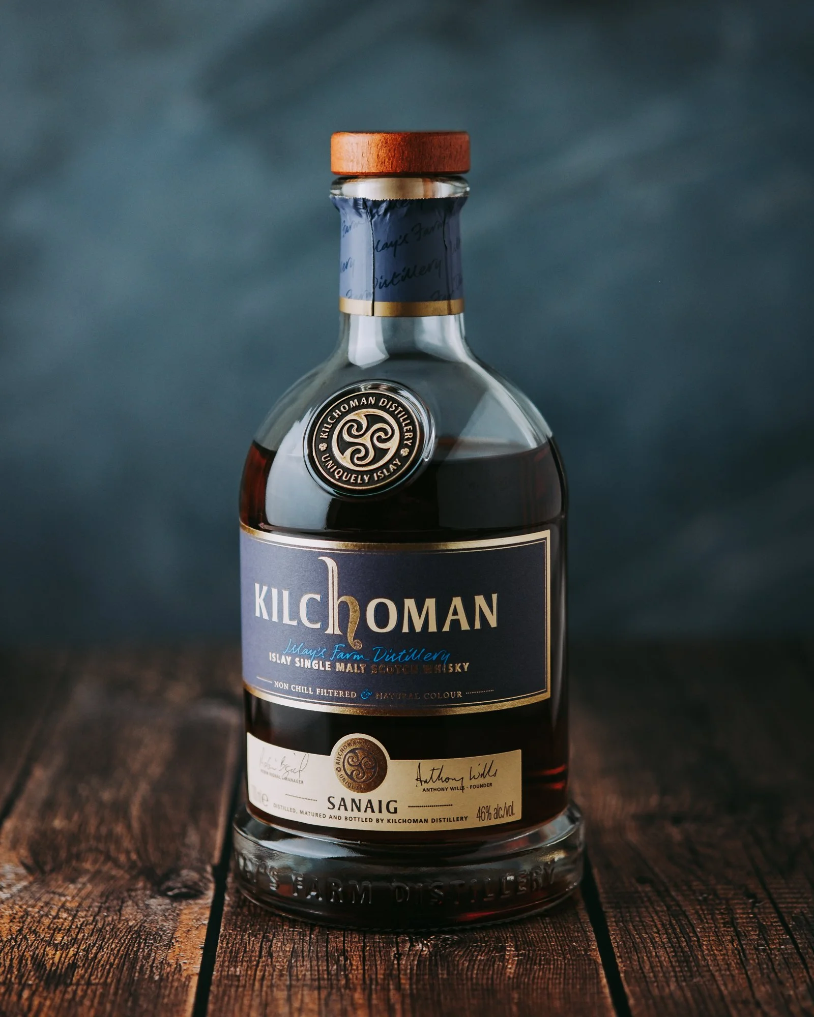
My editing style and color grading is based on my three main styles/presets named after perfume aura that they reminds me off.
They were carefuly and professionally designed to match together and compliment each other on the certain level, and they were built and upgraded in last three years in order to enhance visual storytelling in my photography.
fahrenheit
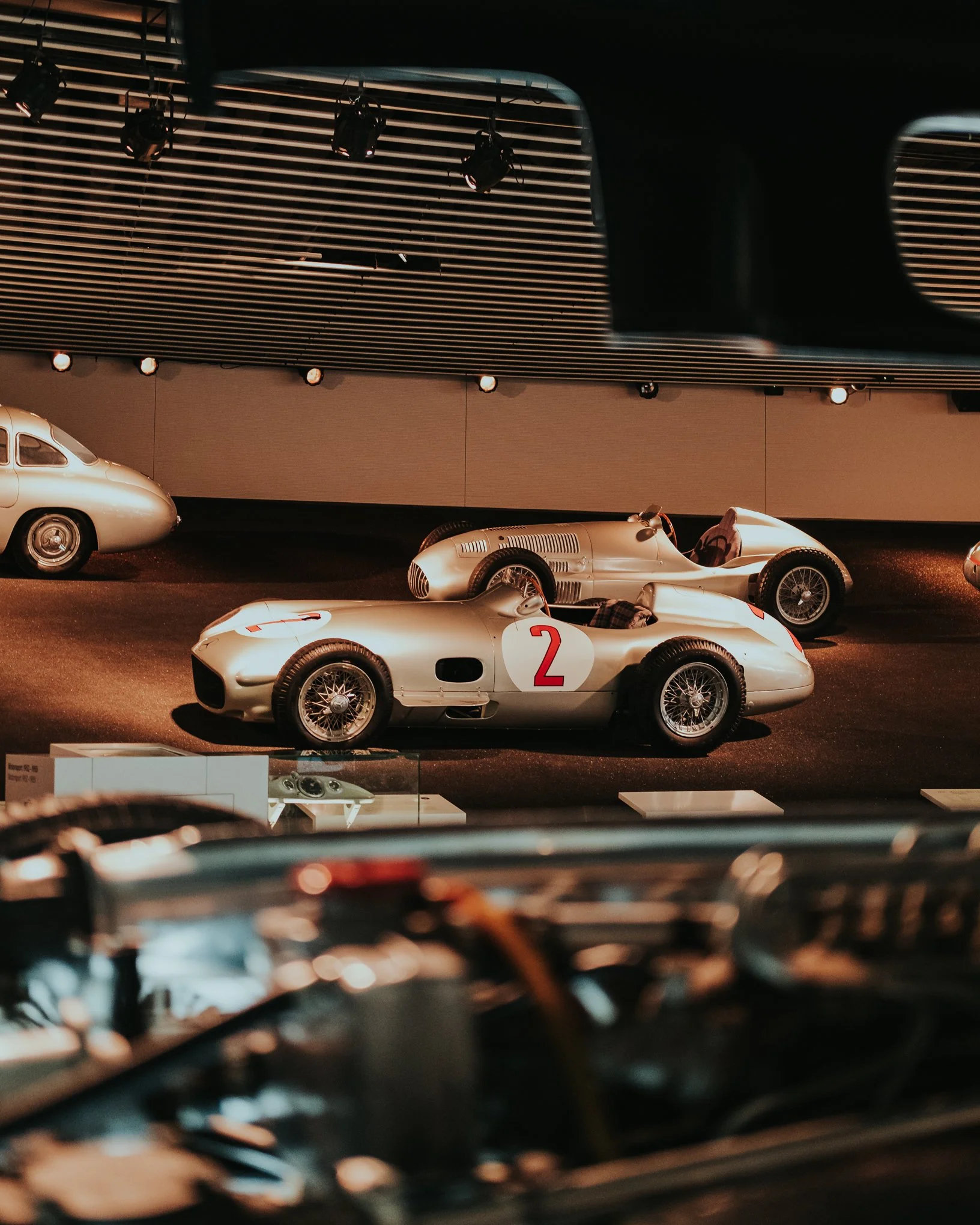
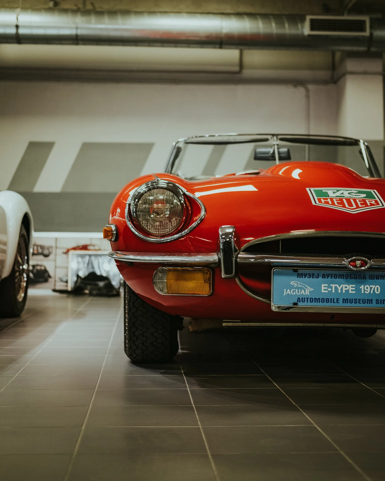
Main preset and editing style across the Top Note Show™ project. Cinematic, vintage and unique!
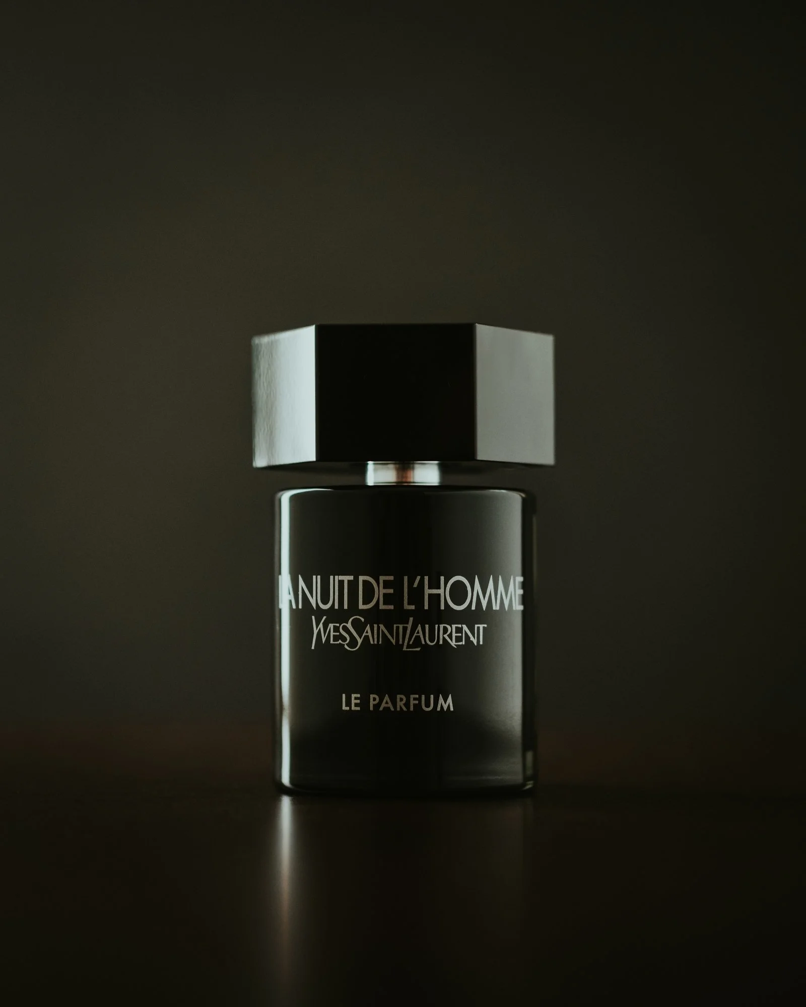
Preset inspired and named after my favourite perfume. It shares flamelike orange color cast as legendary perfume bottle and deep greenish almost teal petrolium faded blacks achived through split toning and tone curves. It is my signature editing style with retro vibe.
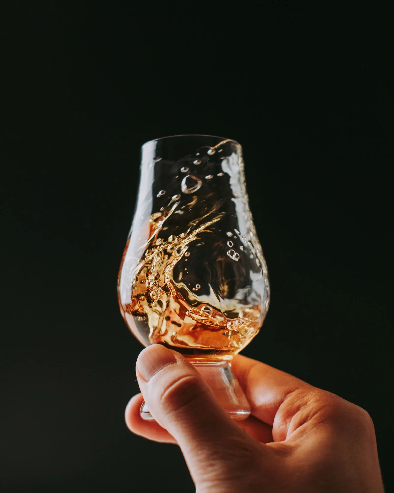
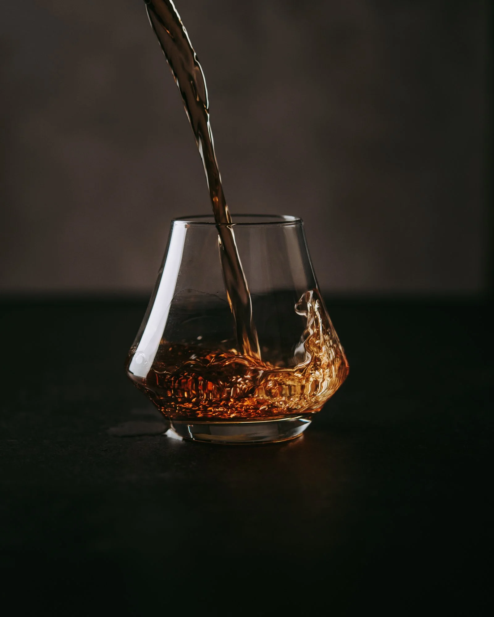
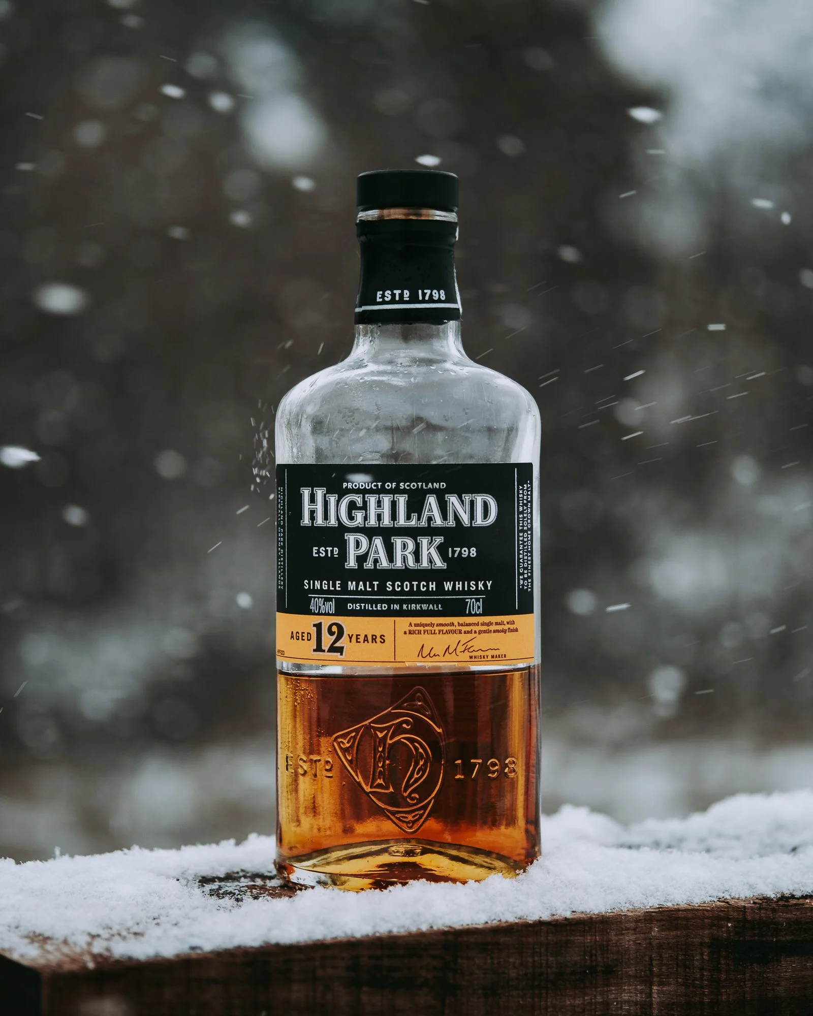
malt
Whisky preset with amplified warm resinous amber color and mate black ashy finish like a true peated single malt whisky. This editing style boost the look of liquids giving them crystal clear ambery vibe in a glass making it almost drinkable in the photos.
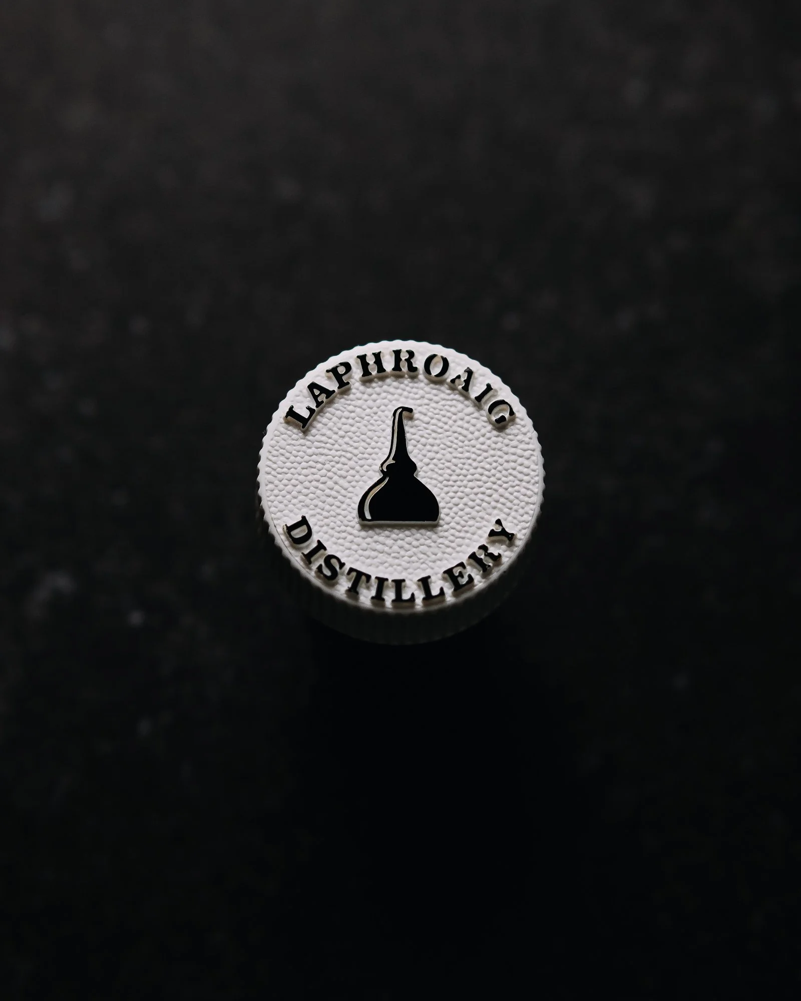
magnetism
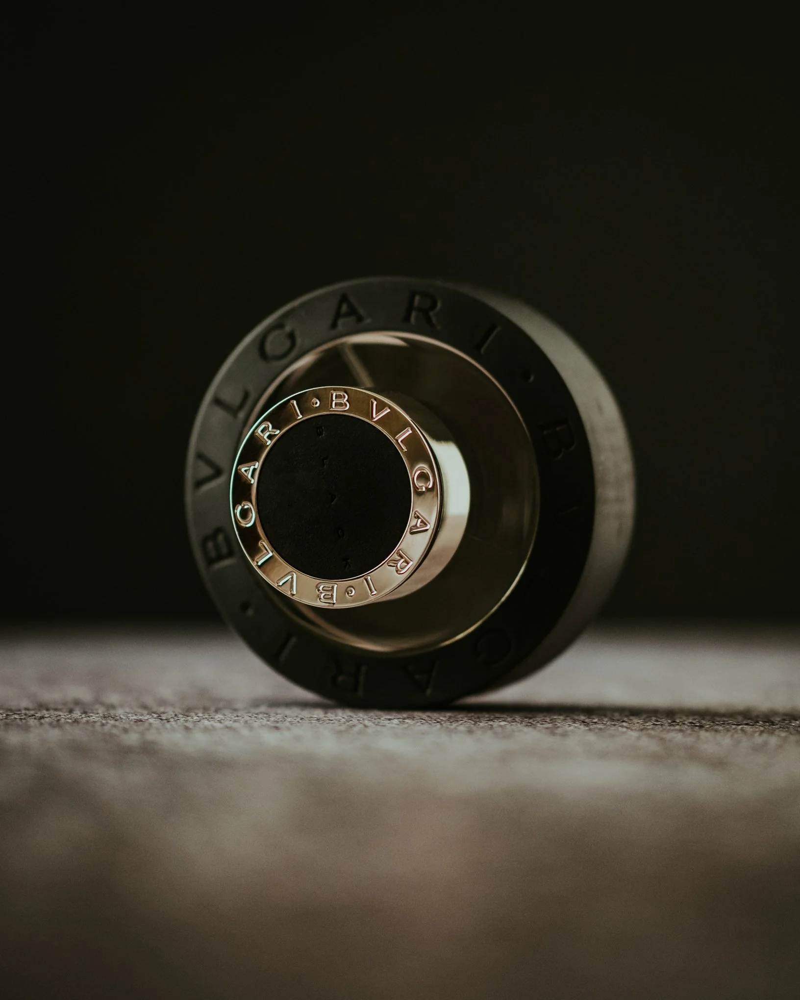
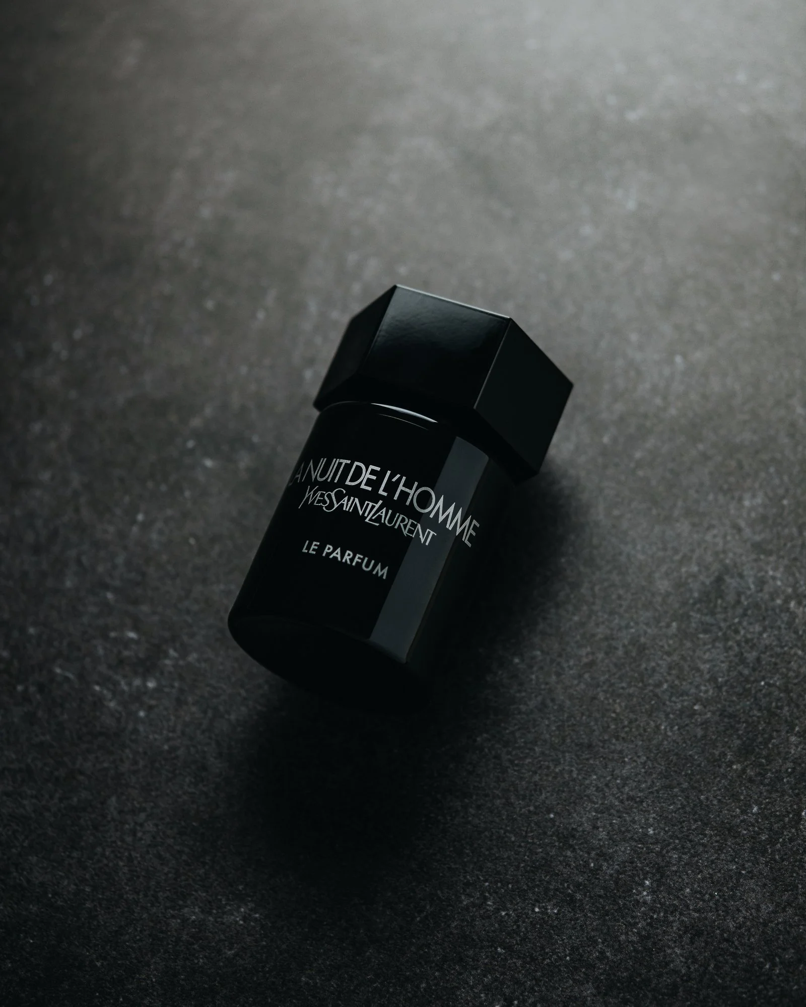
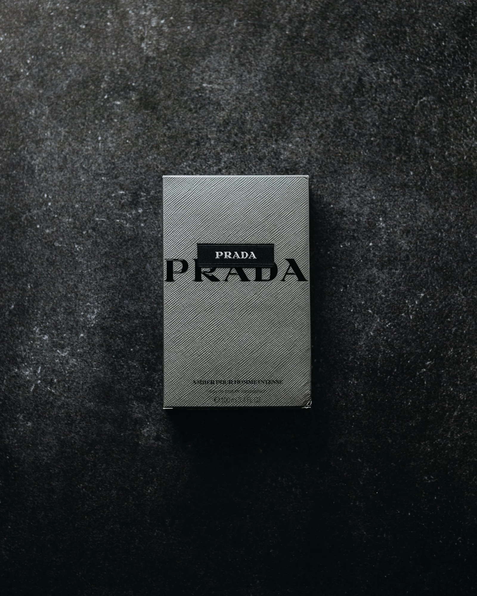
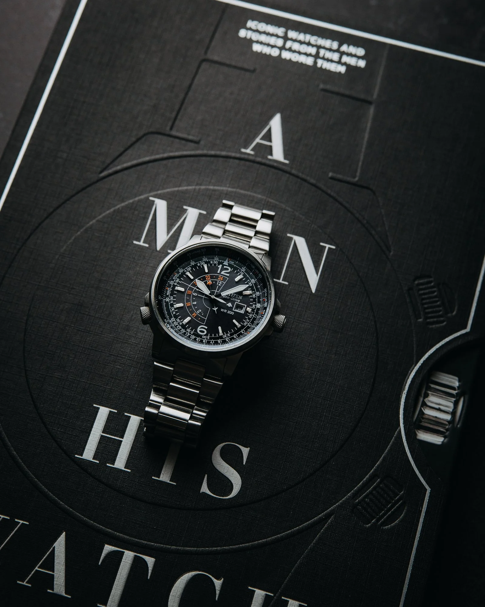
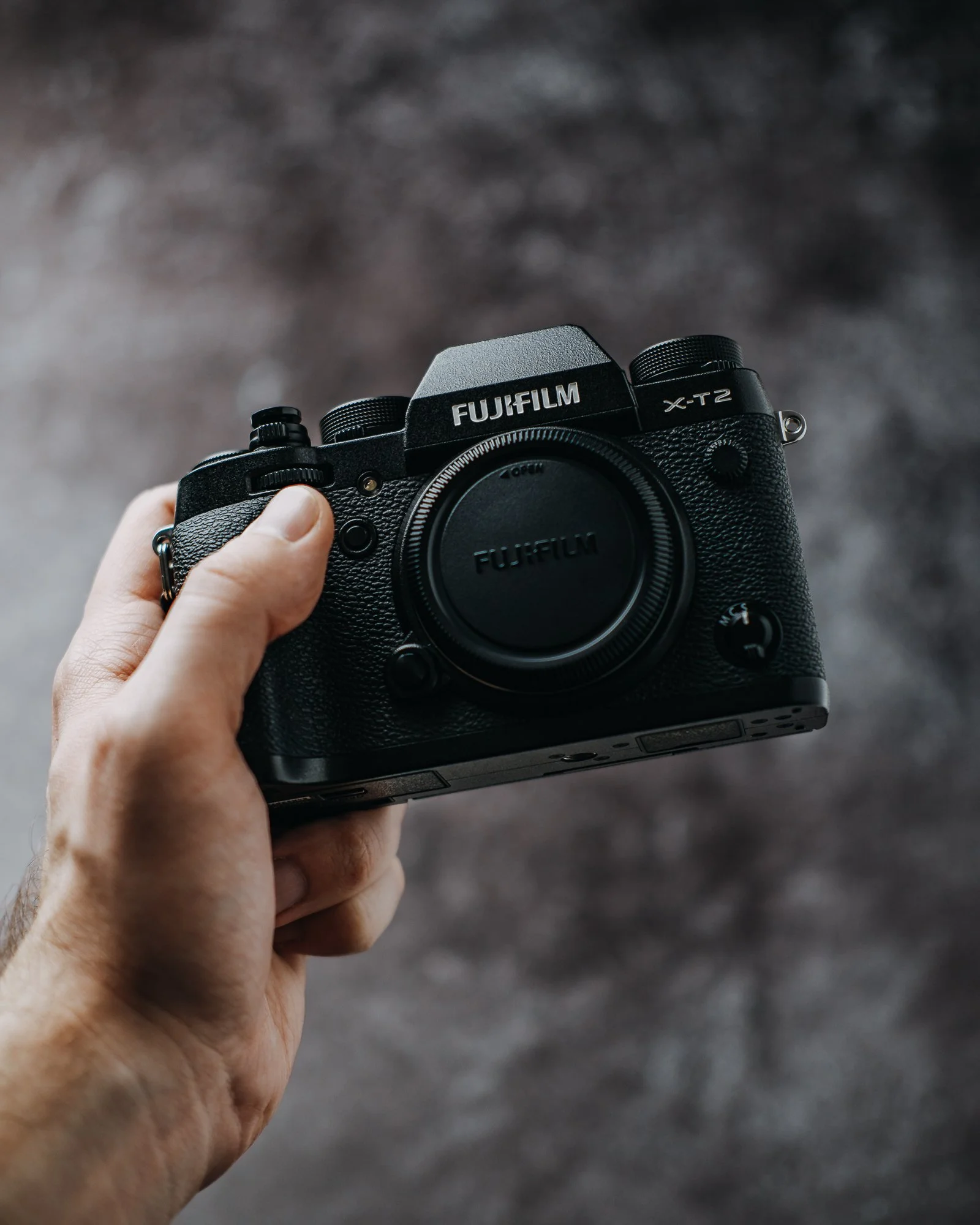
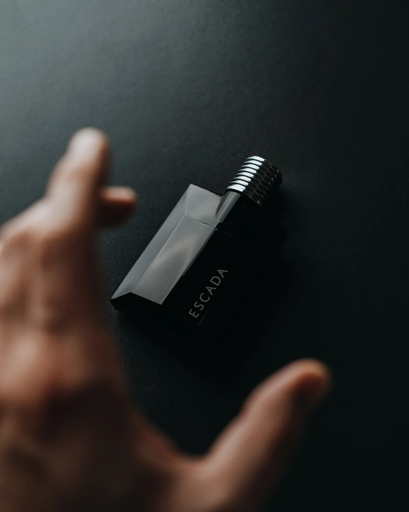
Cold, industrial and electric, editing style with blue and purple hue, pure blacks and strong highlights. Magnetism works perfectly with black products, metalic objects and glossy items giving them polarizing look.
